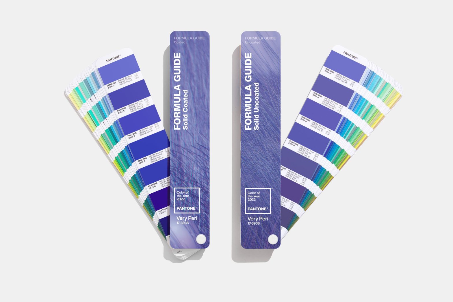
It’s Christmas day for color lovers everywhere, with The Pantone Color Institute officially unveiling their 2022 Pantone Color of the Year—PANTONE® 17-3938 Very Peri.
PANTONE touts Very Peri as a new color “whose courageous presence encourages personal inventiveness and creativity.” It’s also the first time in the history of the Pantone Color of the Year program that PANTONE has created an entirely new color for the title, underscoring the global innovation and transformation taking place in our society that Very Peri is to reflect.
“As we move into a world of unprecedented change, the selection of PANTONE 17-3938 Very Peri brings a novel perspective and vision of the trusted and beloved blue color family,” said Leatrice Eiseman, executive director for Pantone Color Institute, in a press release.
“Blending the faithfulness and constancy of blue with the energy and excitement of red, this happiest and warmest of all the blue hues introduces an empowering mix of newness,” PANTONE further explained in the same press release.
If you’re like us, you might be doing a double-take at this Very Peri, which by our PRINT team’s estimations is as purple as it gets. Is Very Peri the newest version of the black & blue vs. white & gold dress debate? Are the color masters at PANTONE purposefully stoking the next viral phenomenon with their 2022 Color of the Year selection?
Whether you see blue, purple, or something in between, Very Peri intends to symbolize the global zeitgeist of the moment and the transition we are going through in light of the global pandemic. It’s a forward-thinking color, instilled with a carefree confidence and daring curiosity meant to inspire the creative spirit. “PANTONE 17-3938 Very Peri places the future ahead in a new light,” added PANTONE.
There’s always a lot riding on the Pantone Color of the Year, which is chosen to “reflect what is taking place in our global culture.” That’s a lot for a single color to take on if you ask me! But I trust PANTONE to not give a hue more than it can handle, as every year for the last 23 years, they comb the world thoroughly for their annual selection, analyzing color trends across multiple industries. These include entertainment, traveling art collections, fashion, all areas of design, popular travel destinations, lifestyle trends, play styles, socio-economic conditions, new technologies, materials, textures, and effects that impact color, relevant social media platforms, and even sporting events.
Very Peri will now get added to the Pantone Fashion, Home, and Interiors Color System, the most widely used color standards system for fashion, textile, home, and interior design. It’s a versatile tone, lending itself to adaptability in the design world that will also be accessible through the Pantone Connect digital color platform along with a series of four palettes.
I’m still not convinced PANTONE isn’t just having some fun at our expense by referring to Very Peri as a blue, but it’s an otherwise inoffensive hue with a calming and soothing presence I know we could all use a bit more of right now.
Source: https://www.printmag.com/


